
Introduction
What are UI Extensions?
UI Extensions are integrations that can be installed into Twist and add additional UI functionality.
We have three types of UI Extensions:
- Composer Extensions - These are extensions triggered from the composer's Quick Actions button.
- Context Menu Extensions - These are extensions triggered from the context menu of a thread/comment/message.
- Settings Extensions - These are extensions that are accessed via the in-app settings from within Twist itself
Extension Lifecycle
UI Extensions work via a turn-based model. The user asks for a UI, and the integration provides it. Once the user interacts with the extension, the client sends another request to the integration. The integration decides how to handle the interaction. It responds either with another UI or a request to execute a specific action on the client-side. This interaction cycle continues until the integration is terminated or reaches an exit condition where there's no more to show the user.
Below, you can see an example flow of our Giphy composer extension from beginning to end. If you'd like to see the complete payloads, you can use the Giphy extension in Twist and inspect the traffic occurring when interacting with the extension.
Adaptive Cards
Your integration returns UIs based on Adaptive Cards which Twist then renders for the user. Part of the response from the extension will be to include a card object (when applicable), the basic schema for which can be found here.
Versioning
Details about the versioning (Data Exchange Format/Doist Card).
Handling User Requests
Client and User Information
Each request to your extension will contain information about the client that sent the data (eg, mobile/desktop), as well as a small amount of information about the user making the request.
This is called the Data Exchange Format, and details what you can expect from the client, and what the client expects to be sent back.
- Context (
context) - Information about the environment and the user that's using the integration, including which thread / channel / message it contributing, etc. - Action (
action) - We need to be able to identify the type of action the user has executed on the client so that the backend can act accordingly and send it sufficient data to act on it - Extension Type (
extensionType) - This will identify which type of extension it is, currently eithercomposerorcontext-menu. - Maximum Doist Card Version (
maximumDoistCardVersion) - This will identify the maximum Doist Card version that the requesting host client can support. This can allow your extension to send back differing UI elements based on what is supported by the client.
Extension Type
We will send an extension type depending on where the user has invoked the integration.
Composer
The user can access these integrations from the composer window of the host client.
Context Menu
The user can access these integrations from the context menu of a conversation message, a thread, or a thread comment. These extensions will provide the following additional data which will reside in action.params (see actions).
Properties
| Name | Description |
|---|---|
| source String | This will be either message, thread, or comment. |
| url String | This will be the deep link url to the message/thread/comment. |
| sourceId Integer | This is the id of the message/thread/comment. |
| content String | For the following, this will be:
|
| contentPlain String | This will be a stripped-down version of the content, with all markdown formatting removed. |
| postedDate string | This will be the date the message/comment was posted, e.g. "2021-11-23T15:13:49.000Z" |
Settings
If the extension type is settings this means it has been triggered from within Twist's in-app settings. Here you can have any settings the user can change for your extension.
Maximum Doist Card Version
This is the maximum version of Doist Card that the requesting host can support. The host will send this so that the extensions can return cards that the host can display. An example of why this is needed is if a user hasn't been able to update to the latest version of Twist that supports the latest version of Doist Card, the extension can send back a card that will be supported by that version of host application. Should the extension not support a lower version of Doist Card, then the extension can set the minimum cardist version when they create their integration at https://twist.com/app_console.
Context
We send context information with every request to the integration backend. It contains:
- Theme (
theme) - User (
user) - Twist (
twist) - Platform (
platform)
Theme
This will be the theme of the calling application, either light or dark.
User
It contains the current user that invoked the integration.
A subset of Twist's user fields:
short_nametimezoneidlangfirst_namenameemail
Platform
This will be the platform that the client is making the request from and can be used by the integrations to tailor their UI to the platform requesting. This is an optional field and can be either desktop or mobile.
Twist
Twist specific context items. These are small amounts of information about where in Twist the request was made.
Workspace
It contains the workspace where the user is currently browsing content.
A subset of Twist's workspace fields:
idname
Channel
It contains the current channel in which the user is browsing content. Is not present in the data if the user is not currently browsing a channel
A subset of Twist's channel fields:
idnamedescription
Thread
It contains the current thread in which the user is browsing content. Is not present in the data if the user is not currently browsing a thread
A subset of Twist's thread fields:
idtitle
Conversation
It contains the current conversation in which the user is browsing content. Is not present in the data if the user is not currently browsing a conversation
A subset of Twist's conversation fields:
idtitle
Action
We use the action to signal to the server what kind of interaction does the user expects. We support the following list of interactions:
- Initial (
initial) - Submit (
submit)
Initial
Initial Action examples
{
  "actionType": "initial"
}

{
  "actionType": "initial",
  "params": {
    "source": "message",
    "url": "https://twist.com/a/1234/msg/5678/m/46880670",
    "id": 46880670,
    "content": "Can you do this very specific thing",
    "postedDate": "2021-04-08T13:39:00Z"
  }
}
The initial action type tells the server that the user has just opened the integration and expects to see the first screen in the workflow.
If there is additional data being sent as part of the initial request (for example, with the context menu extensions), this will live in the params field
Submit
Submit Action Example
{
  "actionType": "submit",
  "actionId": "Action.Search",
  "inputs": {
    "myTextInput": "Example text fields response",
    "myNumberInput": "456"
  },
  "data": {
    "submitButtonName": "mainSubmitButton",
    "securityHash": "dajsiodjioasd45457"
  }
}
Whenever a user presses a button, for example, Twist will send all the fields the user has filled out / checked, or otherwise interacted with, back to the server, using the Action.Submit action.
Whenever a user executes an action via the Action.Submit action on the form; the following will be sent to your integration:
- All
Input.*fields in the form of{"inputId": "inputValue} - All
dataproperties of the Submit element
An actionId should be supplied with the request as the submit action on its own may not be very clear as to the action's intended consequence.
Security
In order for your UI Extension to remain secure, when a request is made we will include an additional header in the request. This will allow your extension to confirm that the request was made from Twist.
The header x-twist-hmac-sha256 will be included. It is a SHA256 HMAC generated using the integration's verification token as the encryption key and the whole request payload as the message to be encrypted. The resulting HMAC would be encoded in a base64 string.
Full Client Request Example
The full request that the client makes to the server can look as follows.
Composer Extension
{
  "context": {
    "platform": "mobile",
    "theme": "dark",
    "user": {
      "short_name": "Anne F",
      "timezone": "Europe/Budapest",
      "id": 4564,
      "lang": "English",
      "first_name": "Anne",
      "name": "Anne Farkas",
      "email": "anne.farkas@outlook.com"
    },
    "twist": {
      "workspace": {
        "id": 4,
        "name": "My Cool Workspace."
      },
      "channel": {
        "id": 44,
        "name": "My Cool Channel",
        "description": "This is where all the cool threads go"
      },
      "thread": {
        "id": 44,
        "title": "Cool People Problems."
      },
      "conversation": {
        "id": 44,
        "title": "BFFs."
      }
    }
  },
  "action": {
    "actionType": "submit",
    "inputs": {
      "myTextInput": "Example text fields response",
      "myNumberInput": "456"
    },
    "data": {
      "submitButtonName": "mainSubmitButton",
      "securityHash": "dajsiodjioasd45457"
    }
  },
  "extensionType": "composer",
  "maximumDoistCardVersion": 0.5
}
Context Menu Extension
{
  "context": {
    "platform": "desktop",
    "theme": "dark",
    "user": {
      "short_name": "Anne F",
      "timezone": "Europe/Budapest",
      "id": 4564,
      "lang": "English",
      "first_name": "Anne",
      "name": "Anne Farkas",
      "email": "anne.farkas@outlook.com"
    },
    "twist": {
      "workspace": {
        "id": 4,
        "name": "My Cool Workspace."
      },
      "channel": {
        "id": 44,
        "name": "My Cool Channel",
        "description": "This is where all the cool threads go"
      },
      "thread": {
        "id": 44,
        "title": "Cool People Problems."
      },
      "conversation": {
        "id": 44,
        "title": "BFFs."
      }
    }
  },
  "action": {
    "actionType": "initial",
    "inputs": {},
    "data": {},
    "params": {
      "source": "message",
      "url": "https://twist.com/a/1234/msg/5678/m/46880670",
      "id": 46880670,
      "content": "Can you do this very **specific** thing",
      "contentPlain": "Can you do this very specific thing",
      "postedDate": "2021-04-08T13:39:00Z"
    }
  },
  "extensionType": "context-menu",
  "maximumDoistCardVersion": 0.5
}
Returning UIs and Action Bridges
When the server responds to the client requests, it needs to send several vital pieces of information:
- UI (
card) - The card is what contains the UI JSON that Twist will render for the user. - Client-side Actions (
bridges) - UI Extensions also need to have a way to instruct the clients to do specific actions on their behalf, such as inject text into the composer. This field is an array of bridges and bridges will be executed in the order in which they appear in the array.
Note that both properties can present at the same time, but at least one must always be filled out.
UI
In most cases, we will display a UI rendered as a Doist Card, which is essentially an adaptive card with some Doist-specific tweaks. We house the entirety of the card within the card property.
Client-side Actions
Example of multiple bridges
{
  "bridges": [
    {
      "bridgeActionType": "composer.append",
      "text": "My Text to Append"
    },
    {
      "bridgeActionType": "finished"
    }
  ]
}
In some cases, we also need to ask the client to execute one of the actions within the app itself, which is where interactions contribute to the interactivity within Twist itself.
Currently, we support the following bridge action types (bridgeActionType):
- Append Text to Composer (
composer.append) - Extension has finished (
finished) - Display Notification (
display.notification)
An integration can send multiple bridges as part of the response and the client will execute each bridge in order. See the example on the right of an integration that wants to add to the composer, then close the extension.
Append Text to Composer
Composer Append Bridge
{
  "bridgeActionType": "composer.append",
  "text": "My Text to Append"
}
When triggered, the client will append a specified text into the Twist text composer. The supported properties are:
- Text (
text) text to append at the end of the current message
Extension has finished
Finished Bridge
{
  "bridgeActionType": "finished"
}
When this bridge is sent back, it's a way for the extension to tell the host that they have finished now and any UI can be closed.
Display Notification
Display Notification Bridge
{
  "bridgeActionType": "display.notification",
  "notification": {
    "text": "Your task has been added to your inbox",
    "type": "success",
    "action": "https://todoist.com/showTask?id=123456789",
    "actionText": "Open task"
  }
}
You can display a lightweight notification as an alternative to a full card, which may be too heavy in some scenarios.
Properties
| Name | Description |
|---|---|
| text String | This is the text to appear in the notification. This should be plain text, Markdown is not supported here. |
| type String | This will be either info, success, or `error. |
| actionUrl String | (Optional) This is the action URL that will be opened if the notification is clicked. |
| actionText String | (Optional) This is the text to be displayed for the action. This should be plain text, Markdown is not supported here. |
Note: For the notification to display an action, both actionUrl and actionText must be provided.
Full Server Response Example
Server Response Example
{
  "card": {
    "type": "AdaptiveCard",
    "body": [
      {
        "type": "Input.Text",
        "id": "TextInput.Search",
        "value": "hello",
        "placeholder": "Search here...",
        "inlineAction": {
          "type": "Action.Submit",
          "id": "Action.Search",
          "title": "Search GIFs"
        }
      },
      {
        "type": "ImageSet",
        "imageSize": "Large",
        "images": [
          {
            "type": "Image",
            "url": "https://media1.giphy.com/media/XYot661SFS62c/giphy.gif?cid=550add23837d0fdf40feddd3a4df0de03a98b54019e5cffc&rid=giphy.gif",
            "altText": "robin williams hello GIF"
          },
          {
            "type": "Image",
            "url": "https://media1.giphy.com/media/icUEIrjnUuFCWDxFpU/giphy.gif?cid=550add23837d0fdf40feddd3a4df0de03a98b54019e5cffc&rid=giphy.gif",
            "altText": "Napoleon Dynamite Hello GIF by 20th Century Fox Home Entertainment"
          },
          {
            "type": "Image",
            "url": "https://media3.giphy.com/media/BVStb13YiR5Qs/giphy.gif?cid=550add23837d0fdf40feddd3a4df0de03a98b54019e5cffc&rid=giphy.gif",
            "altText": "Lionel Richie Hello GIF"
          }
        ]
      }
    ],
    "$schema": "http://adaptivecards.io/schemas/adaptive-card.json",
    "version": "1.2",
    "doistCardVersion": 0.5

  "bridge": {
    "bridgeActionType": "composer.append",
    "text": "My Text to Append"
  }
}
Adding a UI Extension
Extensions are added to integrations in the app console. An integration can have multiple UI extensions added to it; these can be extensions for both the Quick Actions and the context menu, multiple of each are allowed. The exception to this are settings extensions though as an integration can only have one settings extension.
To add an extension, you need to create a general integration (and not channel/thread) first. Then from the integration details page, click on "UI Extensions".
Quick Actions and Context Menu
For an extension to appear in the Quick Actions or context menu, click the "Add a new UI extension" button. Then, enter the details of your extension.
Once you create an extension, you can then add an icon to it. This icon will be the image that appears in the Quick Actions/Context menu list and not the integration's image (as you can have multiple extensions, you may want different icons for each).
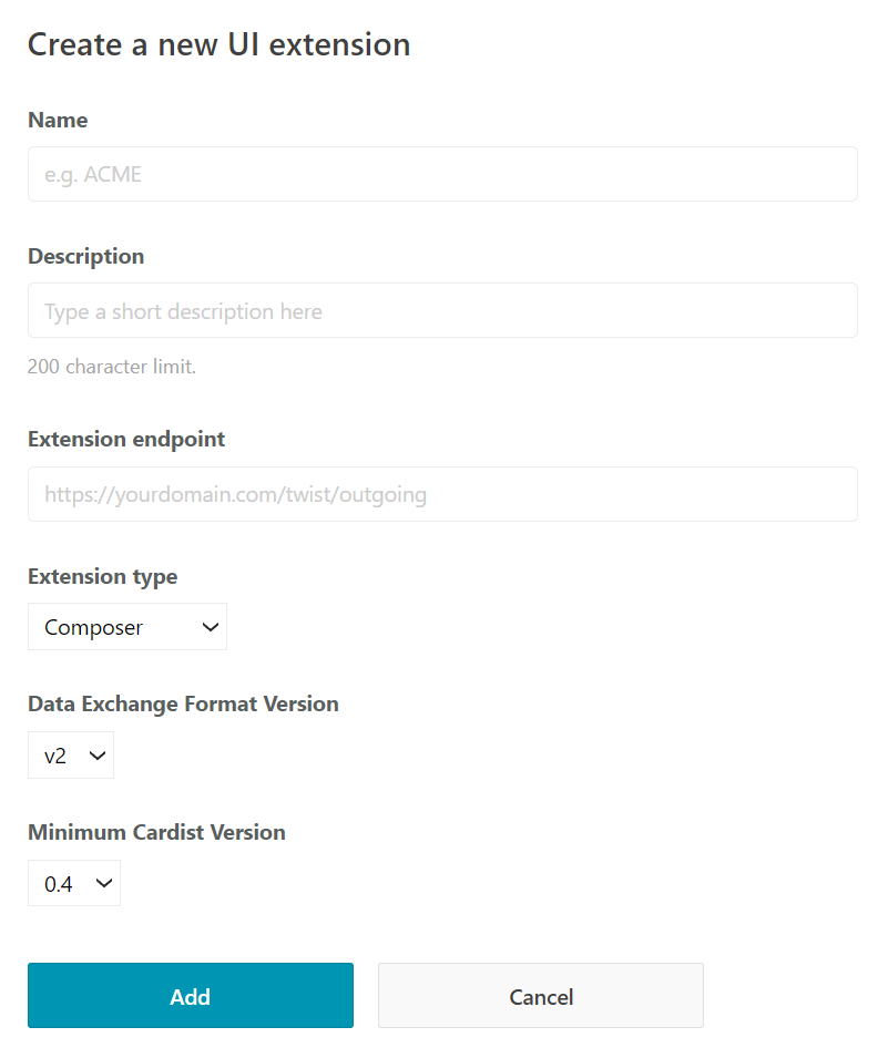
Properties
| Name | Description |
|---|---|
| Name | The name for your UI Extension, it will appear in the Quick Action list, or context menu. |
| Description | This will appear as the sub text in the Quick Action list if the extension is a composer extension. |
| Extension endpoint | The url to your extension's server and where the requests will be sent from Twist. |
| Extension type | Either composer or context menu. |
| Data Exchange Format version | The version of the Data Exchange Format your extension accepts. See ref. |
| Minimum Doist Card version | The minimum Doist Card version your extension supports. Our mobile clients may not support all features and this tells them which extensions they can display for the user. |
Settings Extensions
Use the "Add a settings extension" button to add a settings extension if you need one. An integration can only have one of these.
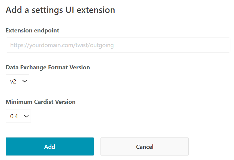
Properties
| Name | Description |
|---|---|
| Extension endpoint | The url to your extension's server and where the requests will be sent from Twist. |
| Data Exchange Format version | The version of the Data Exchange Format your extension accepts. See ref. |
| Minimum Doist Card version | The minimum Doist Cards version your extension supports. Our mobile clients may not support all features and this tells them which extensions they can display for the user. |
Doist Cards
Context
We use Doist Cards for UI Extensions. Doist Cards are based on Adaptive Cards.
We have also created our own schema based on the Adaptive Cards schema. We call this schema Doist Cards. The Doist Cards schema is a subset of the Adaptive Cards schema, that provides the elements currently supported in the Twist clients. We aim for all current versions of 1st party clients to support the latest version of the Doist Cards schema.
Doist Cards Versions
| Doist Cards Version | Spec Status | Android Status | iOS Status | Web Status |
|---|---|---|---|---|
| 0.5 | Draft | In Development | In Development | In Development |
How to Use
This spec below loosely follows the official Schema Explorer. It lists all the elements supported in Doist Cards SDKs (mobile and web). The Version column is the Doist Cards Version, not one of Adaptive Cards.
Cards
| Property | Required | Description | Version |
|---|---|---|---|
| type String | Yes | Must be AdaptiveCard |
0.5 |
| $schema String | Yes | Must be http://adaptivecards.io/schemas/adaptive-card.json |
0.5 |
| doistCardVersion String | Yes | Declares compatibility with a specific version of Doist Cards. Required for mobile support. | 0.5 |
| version String | Yes | The Adaptive Card schema version, which should be set to 1.4 |
0.5 |
| body List of Card Elements | Yes | The card elements to show in the primary card region. | 0.5 |
| actions List of Actions | No | The actions to show in the card's bottom action bar. | 0.5 |
| autoFocusId String | No | The ID of the input the card wishes to get focus when the card is rendered. | 0.5 |
Element
All Card Elements, Containers, and Inputs extend Element and support the below properties.
| Property | Required | Description | Version |
|---|---|---|---|
| id String | No | A unique identifier associated with the item. | 0.5 |
| spacing Spacing | No | The amount of spacing between this element and the preceding element. | 0.5 |
| separator Boolean | No | When true, draw a separating line between this element and the preceding element. | 0.5 |
Card Elements
TextBlock
| Property | Required | Description | Version |
|---|---|---|---|
| type String | Yes | Must be TextBlock |
0.5 |
| text String | Yes | Text to display. | 0.5 |
| size FontSize | No | Font size of the rendered text. | 0.5 |
| isSubtle Boolean | No | If true, displays text slightly toned down to appear less prominent. |
0.5 |
| horizontalAlignment HorizontalAlignment | No | The horizontal alignment of the TextBlock. | 0.5 |
| weight FontWeight | No | Controls the weight of the TextBlock element. | 0.5 |
| color Color | No | Controls the foreground color of the TextBlock elelement. | 0.5 |
| wrap Boolean | No | If true, allow text to wrap. Otherwise, text is clipped. | 0.5 |
Image
| Property | Required | Description | Version |
|---|---|---|---|
| type String | Yes | Must be Image |
0.5 |
| url String | Yes | The URL to the image | 0.5 |
| selectAction Action | No | An Action that will be invoked when the Image is tapped or selected. | 0.5 |
| width String | No | The desired on-screen width of the image, ending in px. E.g., 50px. |
0.5 |
| height String | No | The desired height of the image. If specified as a pixel value, ending in px, E.g., 50px, the image will distort to fit that exact height. |
0.5 |
| altText String | No | Alternate text describing the image. | 0.5 |
| aspectRatio Number | No | The aspect ratio of the image if height/width are known | 0.5 |
| size ImageSize | No | Controls the approximate size of the image. The physical dimensions will vary per host. | 0.5 |
RichTextBlock
| Property | Required | Description | Version |
|---|---|---|---|
| type String | Yes | Must be RichTextBlock |
0.5 |
| inlines List of Inlines | Yes | The array of inlines. | 0.5 |
| horizontalAlignment HorizontalAlignment | No | The horizontal alignment of the RichTextBlock. | 0.5 |
Inline
Inline can be of type String or TextRun.
TextRun
| Property | Required | Description | Version |
|---|---|---|---|
| type String | Yes | Must be TextRun |
0.5 |
| text String | Yes | Text to display. | 0.5 |
| color Color | No | Controls the foreground color of the TextBlock elelement. | 0.5 |
| size FontSize | No | Font size of the rendered text. | 0.5 |
| isSubtle Boolean | No | If true, displays text slightly toned down to appear less prominent. |
0.5 |
| weight FontWeight | No | Controls the weight of the TextBlock element. | 0.5 |
Containers
ActionSet
| Property | Required | Description | Version |
|---|---|---|---|
| type String | Yes | Must be ActionSet |
0.5 |
| actions List of Actions | Yes | The array of Action elements to show. | 0.5 |
| horizontalAlignment HorizontalAlignment | No | The horizontal alignment of the ActionSet. | 0.5 |
Container
| Property | Required | Description | Version |
|---|---|---|---|
| type String | Yes | Must be Container |
0.5 |
| items List of Elements | No | The card elements to render inside the Container. | 0.5 |
| selectAction Action | No | An Action that will be invoked when the Container is tapped or selected. | 0.5 |
| minHeight String | No | Specifies the minimum height of the container in pixels, like "80px". | 0.5 |
| backgroundImage BackgroundImage | No | Specifies the background image. Acceptable formats are PNG, JPEG, and GIF | 0.5 |
| verticalContentAlignment VerticalContentAlignment | No | Defines how the content should be aligned vertically within the container. If not specified top is the default. |
0.5 |
| bleed Boolean | No | Determines whether the element should bleed through its parent's padding. | 0.5 |
ColumnSet
| Property | Required | Description | Version |
|---|---|---|---|
| type String | Yes | Must be ColumnSet |
0.5 |
| columns List of Columns | No | The array of Column to divide the region into. |
0.5 |
| horizontalAlignment HorizontalAlignment | No | The horizontal alignment of the ColumnSet. | 0.5 |
Column
| Property | Required | Description | Version |
|---|---|---|---|
| type String | Yes | Must be Column |
0.5 |
| items List of Elements | No | The card elements to render inside the Column. | 0.5 |
| verticalContentAlignment VerticalContentAlignment | No | Defines how the content should be aligned vertically within the column. | 0.5 |
| width String | No | auto, stretch. 3px format will be supported in future versions of Doist Cards |
0.5 |
| selectAction Action | No | An Action that will be invoked when the Column is tapped. | 0.5 |
Actions
Action.Submit
| Property | Required | Description | Version |
|---|---|---|---|
| type String | Yes | Must be Action.Submit |
0.5 |
| title String | No | Label for button or link that represents this action. | 0.5 |
| style Style | No | Appearance of the action | 0.5 |
| data String or Object | No | Initial data that input fields will be combined with. These are essentially "hidden" properties. | 0.5 |
| associatedInputs String | No | Controls which inputs are associated with the submit action. Default is "Auto" | 0.5 |
Action.OpenUrl
| Property | Required | Description | Version |
|---|---|---|---|
| type String | Yes | Must be Action.OpenUrl |
0.5 |
| url String | Yes | The URL that will be opened when the action is invoked. | 0.5 |
| style Style | No | Appearance of the action | 0.5 |
Inputs
Input.Text
| Property | Required | Description | Version |
|---|---|---|---|
| type String | Yes | Must be Input.Text |
0.5 |
| placeholder String | No | Description of the input desired. Displayed when no text has been input. | 0.5 |
| inlineAction Action | No | The inline action for the input. Typically displayed to the right of the input. It is strongly recommended to provide an icon on the action (which will be displayed instead of the title of the action). | 0.5 |
| label String | No | Label for this input | 0.5 |
| isRequired Boolean | No | Whether or not this input is required | 0.5 |
| errorMessage String | No | Error message to display when entered input is invalid | 0.5 |
| rows Number | No | The number of rows a multi-line text input should display. 1 | 0.5 |
| inputStyle InputStyle | No | The style the text input should display as. 1 | 0.5 |
| value String | No | The initial value for this field | 0.5 |
Input.Date
| Property | Required | Description | Version |
|---|---|---|---|
| type String | Yes | Must be Input.Date |
0.5 |
| label String | No | Label for this input | 0.5 |
| isRequired Boolean | No | Whether or not this input is required | 0.5 |
| errorMessage String | No | Error message to display when entered input is invalid | 0.5 |
| value String | No | The initial value for this field, in the format YYYY-MM-DD |
0.5 |
| min String | No | The minimum inclusive value for the field, in the format YYYY-MM-DD |
0.5 |
| max String | No | The maximum inclusive value for the field, in the format YYYY-MM-DD |
0.5 |
Input.Time
| Property | Required | Description | Version |
|---|---|---|---|
| type String | Yes | Must be Input.Time |
0.5 |
| label String | No | Label for this input | 0.5 |
| isRequired Boolean | No | Whether or not this input is required | 0.5 |
| errorMessage String | No | Error message to display when entered input is invalid | 0.5 |
| value String | No | The initial value for this field, in the format HH:mm |
0.5 |
Input.ChoiceSet
| Property | Required | Description | Version |
|---|---|---|---|
| type String | Yes | Must be Input.ChoiceSet |
0.5 |
| label String | No | Label for this input | 0.5 |
| isRequired Boolean | No | Whether or not this input is required | 0.5 |
| errorMessage String | No | Error message to display when entered input is invalid | 0.5 |
| value String | No | The value of the initial choice | 0.5 |
| choices Object | Yes | An array of Choices | 0.5 |
| selectAction Action | No | An Action that will be invoked when the selection is changed. 1 | 0.5 |
| isSearchable Boolean | No | Sets whether this list of choices is searchable and the text value can be free-form. | 0.5 |
Input.Toggle
| Property | Required | Description | Version |
|---|---|---|---|
| type String | Yes | Must be Input.Toggle |
0.5 |
| title String | Yes | Title for the toggle. | 0.5 |
| id String | Yes | Unique identifier for the value. Used to identify collected input when the Submit action is performed. | 0.5 |
| value String | No | The initial selected value. This will return true or false. If you want the toggle to be initially on, set this to true. |
0.5 |
| wrap Boolean | No | If true, allw text to wrap, otherwise text is clipped. |
0.5 |
| label String | No | Label for this input | 0.5 |
| isRequired Boolean | No | Whether or not this input is required | 0.5 |
| errorMessage String | No | Error message to display when entered input is invalid | 0.5 |
Choice
Describes a choice for use in a ChoiceSet.
| Property | Type | Required | Description | Version |
|---|---|---|---|---|
| title | string |
Yes | Text to display. | 0.2 |
| value | string |
Yes | The raw value of the choice. | 0.2 |
Types
BackgroundImage
| Value | Required | Description | Version |
|---|---|---|---|
| url String | Yes | URL of the background image. | 0.5 |
| fillMode ImageFillMode | No | Describes how the image should fill the area. If none specified, cover is applied. |
0.5 |
Enums
Spacing
Please note: The values sent for this are case insensitive
| Value | Version |
|---|---|
| default | 0.5 |
| none | 0.5 |
| small | 0.5 |
| medium | 0.5 |
| large | 0.5 |
HorizontalAlignment
Please note: The values sent for this are case insensitive
| Value | Version |
|---|---|
| left | 0.5 |
| center | 0.5 |
| right | 0.5 |
VerticalContentAlignment
Please note: The values sent for this are case insensitive
| Value | Version |
|---|---|
| top | 0.5 |
| center | 0.5 |
| bottom | 0.5 |
FontWeight
Please note: The values sent for this are case insensitive
| Value | Version |
|---|---|
| lighter | 0.5 |
| default | 0.5 |
| bolder | 0.5 |
FontSize
Please note: The values sent for this are case insensitive
| Value | Version |
|---|---|
| default | 0.5 |
| small | 0.5 |
| medium | 0.5 |
| large | 0.5 |
| extraLarge | 0.5 |
Color
Please note: The values sent for this are case insensitive
| Value | Version |
|---|---|
| default | 0.5 |
| dark | 0.5 |
| light | 0.5 |
| accent | 0.5 |
| good | 0.5 |
| warning | 0.5 |
| attention | 0.5 |
ImageFillMode
Please note: The values sent for this are case insensitive
| Value | Description | Version |
|---|---|---|
| cover | The background image covers the entire width of the container. Its aspect ratio is preserved. Content may be clipped if the aspect ratio of the image doesn't match the aspect ratio of the container. verticalAlignment is respected (horizontalAlignment is meaningless since it's stretched width). This is the default mode and is the equivalent to the current model. | 0.5 |
| repeat | The background image isn't stretched. It is repeated first in the x axis then in the y axis as many times as necessary to cover the entire container. Both horizontalAlignment and verticalAlignment are honored (defaults are left and top). | 0.5 |
Style
Please note: The values sent for this are case insensitive
| Value | Description | Version |
|---|---|---|
| default | Action is displayed as normal | 0.5 |
| positive | Action is displayed with a positive style (typically the button becomes accent color) | 0.5 |
| destructive | Action is displayed with a destructive style (typically a red, warning-like design) | 0.5 |
InputStyle
Please note: The values sent for this are case insensitive
| Value | Description | Version |
|---|---|---|
| text | This is a regular text input | 0.5 |
| tel | This is a number (eg, telephone) input | 0.5 |
| This is an email input | 0.5 | |
| url | This is a URL input | 0.5 |
| search | This is a search box input | 0.5 |
ImageSize
Please note: The values sent for this are case insensitive
| Value | Description | Version |
|---|---|---|
| auto | Image will scale down to fit if needed, but will not scale up to fill the area. | 0.5 |
| stretch | Image with both scale down and up to fit as needed. | 0.5 |
| small | Image is displayed with a fixed small width, where the width is determined by the host. | 0.5 |
| medium | Image is displayed with a fixed medium width, where the width is determined by the host. | 0.5 |
| large | Image is displayed with a fixed large width, where the width is determined by the host. | 0.5 |
Notes
1
This is Doist Cards only and not part of the adaptive card spec